BLOG : Beware! Wet Paint

Keep up with fresh paintings, news and exhibitions

Subscribe to RSS : Beware Wet Paint
Get Wet Paint on your Facebook

A trash heap with silver service?

the aliens have landed!

I am getting some great feedback from the “Carbon Footprints” exhibition at the Park Avenue Club

It seems people are really enjoying sipping their cocktails and munching their posh nosh, amongst my inedible remains and dusty discards.

The restaurant is for members only, so call ahead for a good time to visit the show between sittings : (973) 301-8233

April 16 - September 10 2012

Carbon Footprints Park Avenue Club 184 Park Avenue Florham Park, NJ www.parkavenueclub.com

Seafoam Pastel Ripples Through the Enchanted Forest

embellished giclee, pastel and charcoal

Hoorah! I am very pleased with my first embellished giclee print 

Back in May, I was pondering whether to add color to the charcoal drawing of a forest. I was yearning to add magical color, but reluctant to give up the elegant black and white drawing... when it occurred to me that I could have both.

After scanning the original drawing at a high resolution (600dpi), I ordered large prints from Imagekind. Two types of paper looked like they might have enough texture to take the Pan Pastels I wanted to use. This one is my favorite, Somerset Velvet, with enough tooth to hold the pastel, with the luxurious feeling of working with a quality watercolor paper - yummy

(I am still working on the second print: too much texture for my taste, and less fun to work with)

Both the paper and ink  are archival quality, and these guys could get really big!  Up to 58 x 44 inches, although I'm not sure my easel would manage that, I'd have to work on the floor. That's it, Lulu is banished from the studio - doggie paws were not the kind of embellished prints I had in mind

I have a notion to do a set of 4 prints to represent the seasons at some point, but I am also taking requests. So please help me out and leave a comment with your favorite color scheme to inspire a creation - one dark color, one mid range and one highlight should be all I need

Description: Burgundy red and seafoam green pastel ripple through the woodland, adding enchanting mystery to forest shadows.

21 x 16 inches , pastel embellished archival giclee print, © Jo Bradney 2010 All Rights Reserved

Black and White Charcoal forest art print from Imagekind

Burgundy and Seafoam Pastel Forest art print from Imagekind

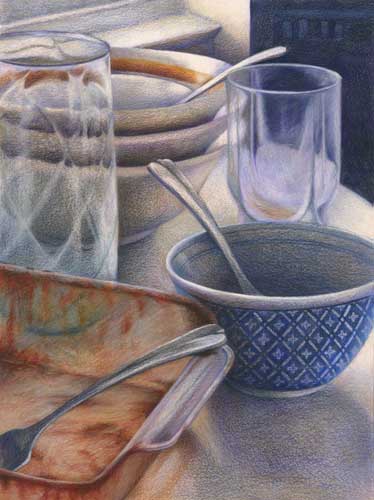
I can't wash up - it's ART

color pencil still life drawing of dirty dishes

color pencil still life drawing of dirty dishes

This was one of those "found" still lifes (lives?) that snapped me awake from my everyday routine and sent me running for my camera, all alive and excited about washing up.

(any excuse not to actually do the chores)

Hot off the drawing table and into a frame, this still life is destined for the art show at the JCC this January.

If you are in West Orange, NJ this month, please stop by the Opening Reception on January 10 for some nibbles and a wee drinkie.

If you are not lucky enough to be sampling the frozen delights of New Jersey this Midwinter, you can hop over to the preview page to view the art - PJ's and fluffy socks welcome.

Other December news -  a HUGE thank you to Sarah Petruziello for her hard work organising the small works show BANG!4 this year. Much fun and joy as usual and another very successful year. Cheers m'dear!

Color Pencil Drawing cloudscape update

cloud5
cloud5

It is hard to see on the screen, especially a laptop, but there are a few details picked out on the house silhouette.

I still need to work on the sky - some of those clouds are looking a bit flat and refine some of the details on the house -think it needs some chimneys but this one is nearly done. Just got to keep polishing away the waxy bloom from the color pencil.

Leave a comment if you spot anything else that needs fixing. Critique by Blog! Gotta love it.

How to Paint like Monet

this one is Monet's
this one is Monet's
this one is mine
this one is mine

With the proceeds of the miniature sale I treated myself to a workshop at NJCVA this weekend, taught by Victoria Starger. My knowledge of art history can be described as "spotty" at best, so this seemed an ideal class - "active" art history.

Rather than copy the painting straight, I decided to draw the actual still life, but looked to Monet's painting for inspiration on colors and brush strokes. I am very happy to have discovered Vermilion, which makes the soft warm pink in the background and also the orange highlights in the sunflowers. It is not a color I would naturally choose -the color always looks too overpowering - but it is quite delightful.

I think Monet's compositional choices are slightly more masterful than mine. The pointy table edge compared to the straight really draws you into the picture and makes it more dynamic. And the way the sunflowers overflow the picture space enables you to revel in their exuberant abundance.

As you may be able to tell from my picture I was more interested in the purple backdrop than the flowers. I find that is the case with more traditional still life set-ups. It is usually the way the light falls on the tablecloth, the background or the cast shadows that really excite me.

Color Pencil Drawing Update : Cloudscape

cloud4
cloud4

It's been a while since I posted an update on the cloudscape. Progress has been slower than usual but I have been putting in the odd hour here and there over the past week and I was surprised to see how much it had changed.

Work has slowed partly due to an influx of editing work (two websites to make and a couple of portfolios to photograph), and partly due to a 50% sale at my local garden store. The problem with buying lots of half price plants, is that you still have to dig full price holes. But I did manage to time it just right to let Mother Nature do the watering for me.

Colored Pencil Art Work in Progress : Cloudscape I

cloud1
cloud1

Nudged into action by all the fabulous stormy cloudscapes we've been having this summer, I have started on a new large drawing.

To cover the paper quickly at this early stage I am trying out Prismacolor's Art Stix. They are a block of  solid color a bit like a traditional pastel stick, but made from the same "lead" used in their color pencils. Being Prismacolor, they have a wax binder, so I expect to contend with the waxy bloom at a later stage of the drawing - which can sometimes happen with a heavy application of this brand. I will finish off the finer details with traditional pencil, but it is so liberating not to have a tiny point to work with at this large planning stage.